
Here is my ranking of the Premier League away kits for the 2020/21 season.
Again, as with my ranking of the HOME KITS, I apologise for any controversial decisions that may cause annoyance from your reading of my list. These are just my opinions. I didn’t even take Art for GCSE, so I probably don’t have any idea, right?
P.S. Burnley, Fulham and Leeds haven’t brought their away kits out yet, so I will add them to my list as soon as they are.
17. Wolves
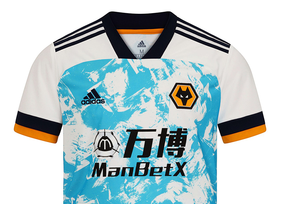
In, last place, I just had to go for this monstrosity. The sleeves don’t work with the torso, and neither work on their own or together. I just find it horrible to look at, and the rest of Europe will probably be glad that Wolves didn’t qualify for the Europa League, as that kit should stay quarantined for as long as humanly possible.
16. West Brom
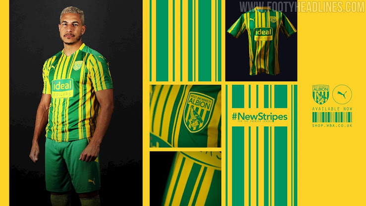
Sorry West Brom fans, your team is hard to design kits for. This away kit looks a bit too much like a Norwich kit, just with a boiler advertisement stamped on the front.
15. Newcastle
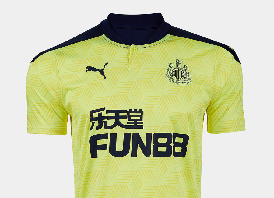
I’ve never really liked green kits, and Newcastle’s lime version is no exception. The shoulders look a bit off, too. The cubic pattern may work for some, but it makes it a confusing one to look at, and I can’t bring myself to rate it any higher.
14. Tottenham
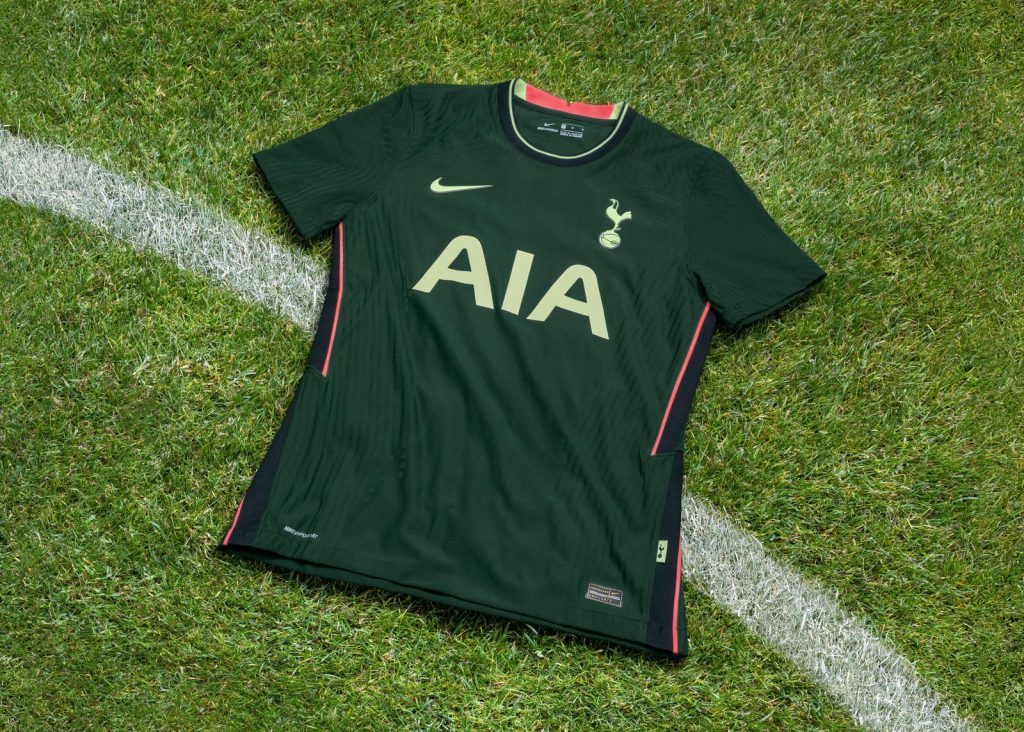
Another green kit, another low position. I do like the idea of the ‘British racing green’ colour, but the pink highlights on the sides of the shirt and the collar are a big, big turn-off for me.
13. Crystal Palace
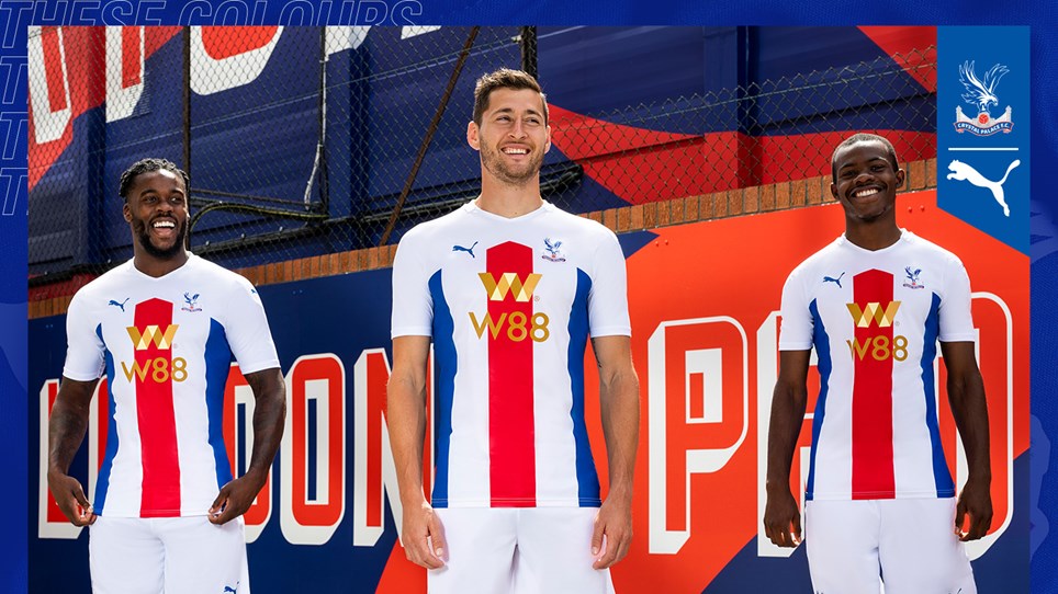
“These colours unite us all”. I think they have just ‘united’ the fanbase against Puma ever making a Palace kit again.
12. Liverpool
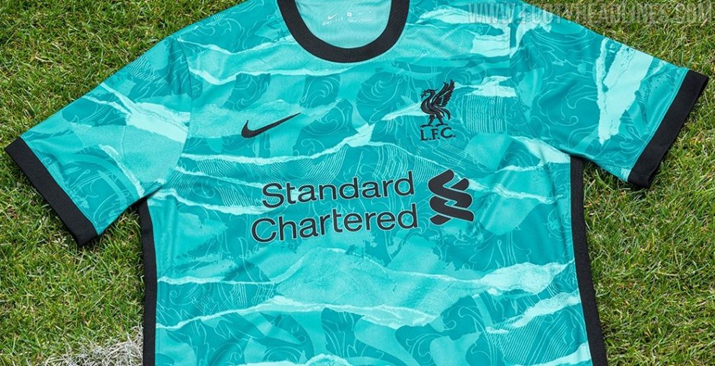
I am usually a big fan of turquoise as a colour… but not for a kit. I think that some black bars on the shoulder connecting the collar to the sleeves would have elevated this kit higher, but, as it is, it’s just not for me.
11. Brighton
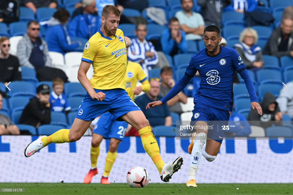
Mixing yellow and blue is rarely a good idea, but Nike almost pulled it off. Then they added that collar. Yuck. So close, lads, so close.
10. Arsenal
Embed from Getty ImagesI don’t think the kit is as bad as many say it is, but white kits just don’t suit Arsenal. Although the idea of Tottenham players being mauled by tigers may bring the fans some joy, and I’m sure that was what the Adidas boys were going for.
9. Chelsea
Embed from Getty ImagesThe kit reminds me of my old pyjamas too much for me to rate this kit any higher. The sponsor is still laughable, but I’m sure Chelsea fans will be too busy queuing up to kiss Roman Abramovich’s feet to notice or care.
8. West Ham
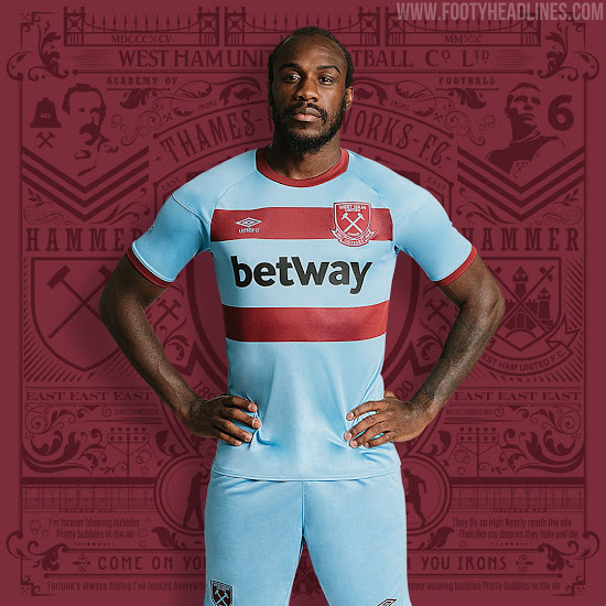
The stripes are nice, and the larger badge is great. I just don’t find that colour of blue as exciting as I would’ve liked. A relatively boring kit in my opinion.
7. Manchester City
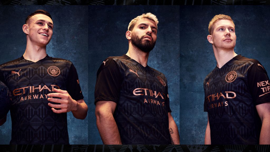
The pattern on the shirt works for me. The colour of the badge and sponsor works for me. Whilst not everyone’s favourite, I think that this is a kit with quite a bit of class and style. It just doesn’t appeal to me as much as the others in the top six of my list.
6. Everton
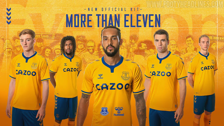
The orange colour choice was bold, but I think it really pays off with this effort from Hummel. The kit itself is relatively simplistic, and I think that helps it a lot.
5. Leicester
Embed from Getty ImagesI find that maroon base colour very classy, and it’s a colour I don’t see in the Premier League too often. The sponsor works with the kit very well, too. A really nice away kit from Adidas.
4. Sheffield United
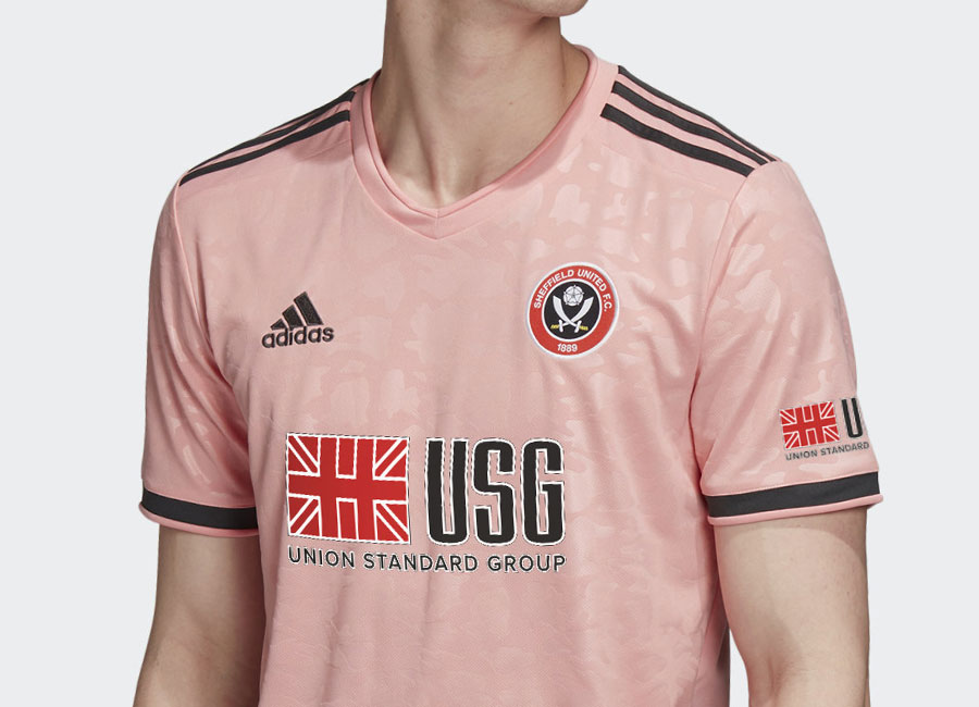
Pink kits aren’t always my favourite, but this Blades kit is stunning. The black stripes work really well, and the sponsor is the only thing that lets this kit down a notch. I love the pattern, too. A great effort.
3. Southampton
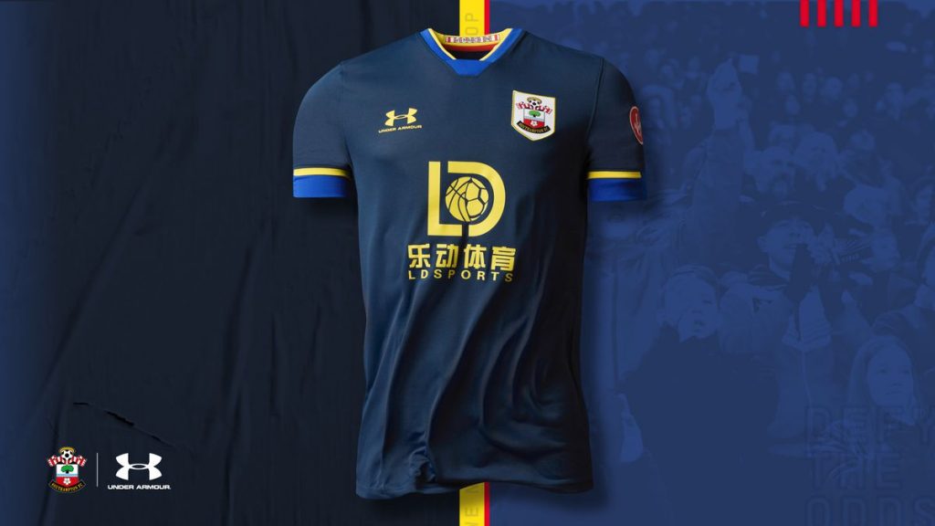
A stylish and retro Saints kit. The dark blue is beautiful, and the yellow highlights make it look truly majestic. Under Armour have made a kit that I can see fans wearing for a good few years.
2. Manchester United
Embed from Getty ImagesSimple yet stunning. I adore the printed pattern, and the colour scheme just works so well. The white stripes work much better on this kit than on the home kit, and the sponsor adds so much. It is so close to being my favourite away kit for next season.
1. Aston Villa
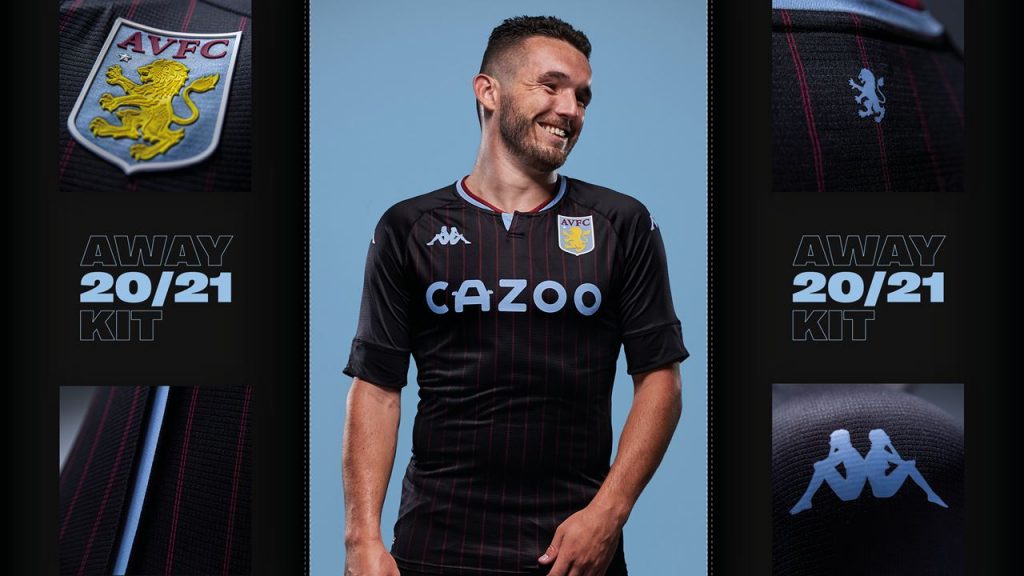
But not close enough. Kappa have produced an absolute beauty. The claret lines on the black base make the kit, and the larger badge makes the kit stand out. The collar is great too. By far my favourite of the Premier League away kits for the upcoming campaign.
Written by Jed Vine


