Today, I will be ranking the Premier League home kits for the 2020/21 season. As you know, this is not a list based on facts but just my opinion. If I rank one of your favourite kits in a low position, please forgive me :).
P.S. Sorry Fulham fans, your kits have not been released yet. Take it up with your club, not me.
19. West Bromwich Albion
Embed from Getty ImagesWest Brom are always a hard team to design a kit for, but, whilst it might work for some, the design just reminds me of a barcode too much. Seeing the lines in motion is enough to give any fan a headache, and the ‘Ideal Boilers’ logo is somewhat laughable.
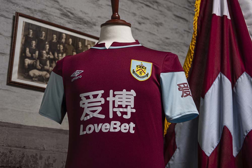
18. Burnley

As far as claret and blue kits go… this one’s a mess. The half-and-half sleeves do not work, and the collar is just horrible. If the collar was an all blue v-neck, it would’ve been a decent kit, but it is not. It is whatever that is.
17. Tottenham Hotspur
Embed from Getty ImagesAnother entry with half-and-half sleeves, and another entry down at the bottom. They just don’t work for me, sorry. The pattern on the shirt isn’t the best, either. I don’t mind the collar, but it just isn’t a very good kit for me.
16. Man City
Embed from Getty Images(Sorry about the picture, I couldn’t help myself.)
The collar isn’t great, and the swimming pool design just doesn’t. work for me. Not a kit that will be remembered fondly in years gone by – unless Lionel Messi is signed while wearing it.
15. Sheffield United

To be honest, I don’t hate the design. On first glance I really liked it. The sponsor is distracting, but that could have been a minor issue. But the fact that the middle stripe’s edges don’t line up with the black base of the collar makes me sick.
14. Crystal Palace
Embed from Getty ImagesThe simplistic design was a nice idea. The finished article was below par. It’s not awful, I just wouldn’t feel right putting it any higher on my list.
13. Aston Villa

I’m not totally against this kit, and I usually like Kappa’s creations. I’m just not in love with the sleeves or the stripes. Again, just my opinion, but I don’t believe it’s better than the rest of the kits in this list.
12. Leicester City
Embed from Getty ImagesI love the gold stripes on the sleeves. The rest of the kit is just a huge downgrade from what they had last year. I’m not saying it’s a bad kit, I’m just a bit disappointed in this year’s effort.
11. Everton
Embed from Getty ImagesThe arrows on the sleeves don’t quite work. I like the majority of the kit, but I wouldn’t rate it any higher than 11th.
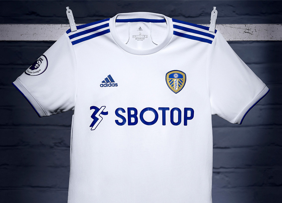
10. Leeds United

I preferred the gold highlights that they had last year, and the sponsor isn’t great. Overall, a relatively nice, simplistic kit.
9. Chelsea
Embed from Getty ImagesA stylish and simple kit, but the sponsor has brought the internet too many memes already that I can’t bear to put it any higher.
8. Liverpool
Embed from Getty ImagesIt may be a shock for many that it is so low in the list, but the green just doesn’t enhance the kit for me. It’s a nice kit, but not good enough for the champions of England in my opinion. It may just be that I was expecting a little more. Sorry.
7. Southampton
Embed from Getty ImagesI love the diagonal stripe, and I like that they tried something new. The sponsor detracts from the kit in a big way though. Not a bad attempt whatsoever.
6. Manchester United

While my initial instincts of ‘bus seat’ have slightly diminished in recent weeks, I am still not entirely convinced. The sponsor works and has worked for many years now, and the signature Adidas stripes make it a good kit for the most part.
5. Newcastle United
Embed from Getty ImagesThe classic and classy black-and-white stripes make the Newcastle jersey a win every season. This year’s entry is no different.
4. West Ham
Embed from Getty ImagesA lovely anniversary kit that is a v-neck collar away from being a masterpiece. Still one of my favourites for this season, though.
3. Arsenal
Embed from Getty ImagesA kit that already has a trophy to its name, Adidas’s second outing with Arsenal has produced another beauty. The pattern is not overly distracting, but I just wish that the collar from last year was on this kit too.
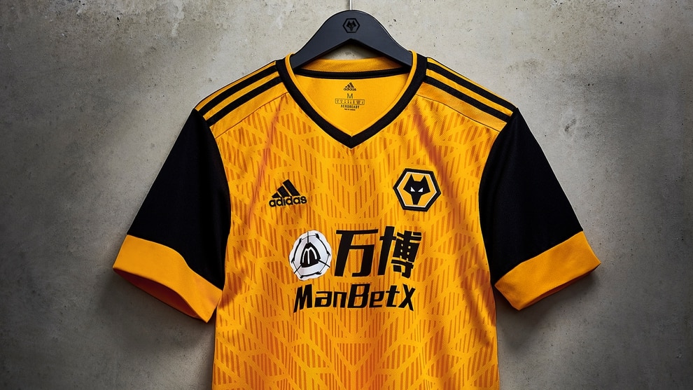
2. Wolverhampton Wanderers

I am aware that the top two of this list will shock most of you, but I think I just have a kink for Wolves’s colour scheme. The collar is perfect, the sleeves are nice, the pattern is slick, and the black Adidas stripes on the shoulders make this a lovely, lovely kit.
1. Brighton
Embed from Getty ImagesI am aware that this kit is not everyone’s favourite, and has found itself far down many other lists. However, I do not care. The kit just works for me on so many levels. The sponsor is great, the pinstripes are new and fresh, and the yellow highlights make the kit stand out. But the real shining light is that collar. While I know it is a turn-off for almost everyone else, that collar is different and stylish, and it tops off a truly exceptional jersey… in my humble and unbiased opinion.
Written by Jed Vine
